 Typography
 View in Figma
Principles
Create visual harmony
Typography should be consistent and cohesive. Use visual hierarchy and space to simplify complex information. is our system of fonts and text styles. It enhances communication, reinforces brand, and guides users' emotions.
Optimize for readability
Help readers understand communications easily and enhance their experience, regardless of their abilities.
Fonts
Inter
Usage: Inter is used for body copy.
Montserrat
Usage: Montserrat is used for headings.
Headings
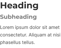
Use headings for page titles or subheadings to introduce content. Headings are sized to contrast with content, increase visual hierarchy, and help readers easily understand the structure of content.
Headings come in a range of sizes, for use in different contexts. See styles section below.
Body Copy
Use body text for main content. They typically appear after headings or subheadings as detailed descriptions and messages, but also as standalone text in components. Body text includes additional paragraph spacing for readability and flow in blocks of text.
Styles / Tokens
To visually align typography across products, typography tokens include font values, including font family, font size, font weights, and line heights for all text styles.
Dashboard
| Style | Size (Desktop) | Size (Mobile) | Weight | Line Height (Desktop) | Line Height (Mobile) |
|---|---|---|---|---|---|
| H1 (dashboard-font-heading-h1) | 2rem | 1.75rem | SemiBold (600) | 40px | 32px |
| H2 (dashboard-font-heading-h2) | 1.375rem | 1.25rem | Bold (700) | 28px | 28px |
| H3 (dashboard-font-heading-h3) | 1.125rem | 1.125rem | SemiBold (600) | 24px | 24px |
| H4 (dashboard-font-heading-h4) | 1rem | 1rem | SemiBold (600) | 24px | 24px |
| p (font-body) | 1rem | 1rem | Regular (400) | 26px | 26px |
| p (font-body-small) | .875rem | .875rem | Regular (400) | 20px | 20px |
Website
| Style | Size (Desktop) | Size (Mobile) | Weight | Line Height (Desktop) | Line Height (Mobile) |
|---|---|---|---|---|---|
| Hero (font-heading-hero) | 2.625rem | See H1 mobile | ExtraBold (800) | 52px | See h1 mobile |
| H1 (font-heading-h1) | 2rem | 1.75rem | ExtraBold (800) | auto | auto |
| H2 (font-heading-h2) | 1.875rem | 1.5625rem | Bold (700) | auto | auto |
| H3 (font-heading-h3) | 1.25rem | 1.25rem | Bold (700) | auto | auto |
| font-heading-s | .875rem | .875rem | SemiBold (600) | auto | auto |
| Lead (font-lead) | 1.125rem | 1.125rem | Regular (400) | 28px | 28px |
| Note (font-note) | .875rem | .875rem | Italic | 20px | 20px |
| p (font-body) | 1rem | 1rem | Regular (400) | 26px | 26px |
| p (font-body-small) | .875rem | .875rem | Regular (400) | 20px | 20px |
Marketing Site
| Style | Size (Desktop) | Size (Mobile) | Weight | Line Height (Desktop) | Line Height (Mobile) |
|---|---|---|---|---|---|
| H2 (font-heading-h2-marketing) | 3.125rem | 1.875rem | Bold (700) | 54px | auto |
| H3 (font-heading-h3-marketing) | 2rem | 1.5rem | Bold (700) | auto | auto |
Formatting
| Style | Use for |
|---|---|
| Bold | Use strong to emphasize text. |
| Italics | Use em to italicize text. |
| Link | Use when you are linking just a few words of text, or when a link is standalone. |
| 1. Ordered List | Use ordered lists to group items in a pre-determined order. |
| • Unordered List | Use unordered lists to group related items. |
| Blockquote | Use with a quotation that is typically longer than a few lines. |
Line Length
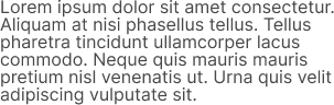
Set the reading environment to suit the reader. Wide lines of text are difficult to read and make it harder for people to focus. While there is no right way to measure the perfect width for text, a good goal is to aim for between 60 and 100 characters per line including spacing. Setting an optimal line length will break up content into easily digestible information.
Please increase your window size to view line length example.
Lorem ipsum dolor sit amet, consectetur adipiscing elit. Mauris nunc pulvinar nibh aliquet. Integer congue velit, nisi, et orci. Pretium praesent viverra convallis duis augue sodales dolor. Morbi vitae turpis elit, arcu in phasellus cursus. Elit amet lectus et commodo, et libero aenean. In et tincidunt mauris ut at erat. Diam integer metus arcu dui senectus nunc nibh ultricies. Facilisis vitae purus mauris aenean ultrices tellus eget. Nec vel nunc, eget urna tristique lorem. Eu tempus faucibus sed nunc non semper amet. Sit non feugiat non adipiscing.
Lorem ipsum dolor sit amet, consectetur adipiscing elit. Mauris nunc pulvinar nibh aliquet. Integer congue velit, nisi, et orci. Pretium praesent viverra convallis duis augue sodales dolor. Morbi vitae turpis elit, arcu in phasellus cursus. Elit amet lectus et commodo, et libero aenean. In et tincidunt mauris ut at erat. Diam integer metus arcu dui senectus nunc nibh ultricies. Facilisis vitae purus mauris aenean ultrices tellus eget. Nec vel nunc, eget urna tristique lorem.
Lorem ipsum dolor sit amet, consectetur adipiscing elit. Mauris nunc pulvinar nibh aliquet. Integer congue velit, nisi, et orci. Pretium praesent viverra convallis duis augue sodales dolor. Morbi vitae turpis elit, arcu in phasellus cursus.
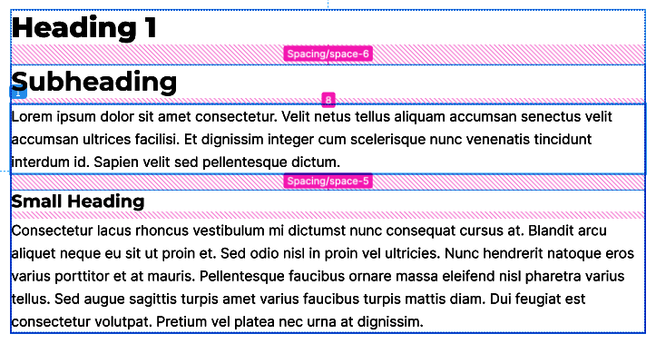
Spacing
Ensure there is adequate spacing between blocks of text and headings. Headings should be close enough to related content, but do not make it too tight.
Typography Crimes

DO NOT
Use unapproved font families.
DO NOT
Don't adjust line heights to fit text, cramped text is more difficult to read. Body text already has optimized line heights for reading comfortably.
DO
Clearly differentiate heading sizes to create hierarchy.
Notes
- Make sure your typography has sufficient color contrast.
- When sizing elements, its recommended to use REM units. These allow elements to scale based on a users brower font size.
- The base font size for typography is 16px, which is equal to 1rem. All elements on the page scale based on this root font-size.
- Please ensure headings and copy have appropriate kerning set.