 Colours
 View in Figma
Primary
AA
Primary 500
- Hex: #405951
- CMYK: C74 M48 Y62 K32
- Design Token: primary-500
- Usage: Our brands primary color. Used for headings, icons or dark section backgrounds.
AA
Primary 400
- Hex: #678277
- Design Token: primary-400
- Usage: Used for dark mode buttons, links, icon buttons, or section backgrounds.
AA
Primary 300
- Hex: #809B8F
- Design Token: primary-300
- Usage: Used for icons, illustrations, or light section backgrounds.
AA
Primary 200
- Hex: #98B7A8
- Design Token: primary-200
- Usage: Used for input-border-focus, icons or light section backgrounds.
AA
Primary 100
- Hex: #b8d8c7
- Design Token: primary-100
- Usage: Used for light section backgrounds, badges or icons.
AA
Primary 50
- Hex: #DEEDE5
- Design Token: primary-50
- Usage: Used for Primary Light button, icons, or light section backgrounds.
AA
Primary 25
- Hex: #EFF6F2
- Design Token: primary-25
- Usage: Used for alert backgrounds, table-header-surface or light section backgrounds.
Secondary
AA
Secondary 500
- Hex: #F0DA9B
- Design Token: secondary-500
- Usage: Used for secondary buttons that should stand out.
Accents
AA
Accent Tan 500
- Hex: #E1DFDA
- Design Token: accent-tan-500
- Usage: Used for section backgrounds, internal hero backgrounds (website).
AA
Accent Tan 400
- Hex: #F0EEEB
- Design Token: accent-tan-400
- Usage: Used for section backgrounds.
AA
Accent Tan 300
- Hex: #F7F6F5
- Design Token: accent-tan-300
- Usage: Used for section backgrounds.
AA
Accent Bronze 600
- Hex: #94897F
- Design Token: accent-bronze-500
- Usage: Used for darker section backgrounds, testimonial borders.
AA
Accent Bronze 500
- Hex: #BAAA9B
- Design Token: accent-bronze-500
- Usage: Used for darker section backgrounds, testimonial borders.
Neutrals/Shades
AA
Black
- Hex: #2D2D2D
- Design Token: black
- Usage: The base text colour for headings and body copy.
AA
Neutral 900
- Hex: #474747
- Design Token: neutral-900
- Usage: Used for icons & subheadings.
AA
Neutral 800
- Hex: #7b7b7b
- Design Token: neutral-800
- Usage: Used for muted body copy and input-border-default in dark mode.
AA
Neutral 700
- Hex: #c2c2c2
- Design Token: neutral-700
- Usage: Used for input-border-hover, muted text in dark mode, section backgrounds.
AA
Neutral 600
- Hex: #e6e6e6
- Design Token: neutral-600
- Usage: Used for disabled buttons, section backgrounds.
AA
Neutral 500
- Hex: #F1F1F1
- Design Token: neutral-500
- Usage: Used as secondary text for dark mode, icon-button-surface, panel-header-surface, input-surface-disabled, input-border-default, section backgrounds.
AA
Neutral 450
- Hex: #F7F7F7
- Design Token: neutral-450
- Usage: Used as the body background for the dashboard, or section backgrounds.
AA
Neutral 400
- Hex: #FAFAFA
- Design Token: neutral-400
- Usage: Used for surface-raised, cards, table-row-even-surface, or subtle section backgrounds.
AA
White
- Hex: #FFF
- Design Token: white
- Usage: Used for white backgrounds or text.
Alerts
AA
Danger
- Hex: #cc3300
- Design Token: danger
- Usage: Used for icons or elements that you want to warn the user about.
AA
Warning
- Hex: #ffcc00
- Design Token: warning
- Usage: Used for icons or elements that you want to warn the user about.
AA
Success
- Hex: #019E7C
- Design Token: success
- Usage: Used for icons or elements that you want to warn the user about.
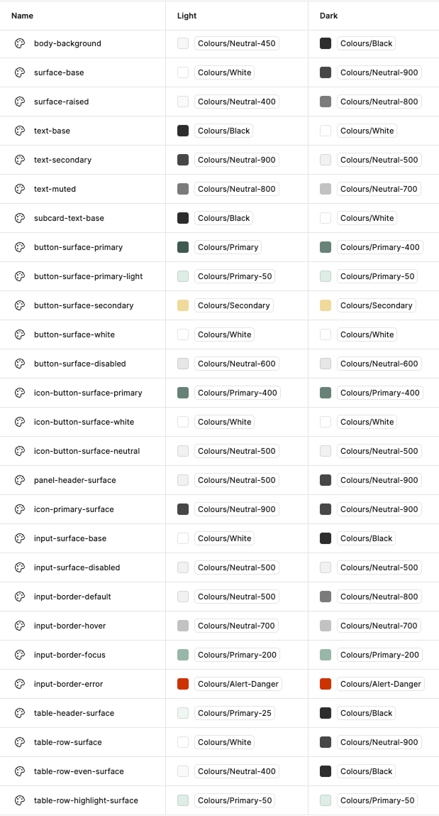
Tokens
Tokens are a method of applying color in a consistent and meaningful way across the dashboard. They provide a layer of abstraction from the hex values themselves, making it easy to implement large scale changes across the dashboard.
Having more generic names allow us to toggle between light and dark modes of a theme easily.
Here are examples of the color tokens in our design system.
Color Crimes
DO NOT
Use unapproved colours in Product design (some exceptions for Marketing).
A
DO NOT
Use low contrast color combinations.
A
DO
Use high contrast color combinations.
Notes
- If you are unsure about a color combination, test it on the WCAG Contrast Checker. It should pass WCAG AA guidelines. Also read the accessibility page for more info.