 Tooltips
 View in Figma
Overview
Tooltips are small, interactive elements that provide additional information when users hover over or focus on an icon or text. They are commonly used to offer context or explanations without cluttering the interface. In this case, tooltips appear when users hover over the small info "i" icons beside form labels.
Anatomy
The tooltip component consists of the following elements:
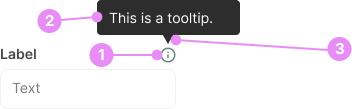
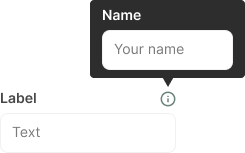
- Info Icon: A small "i" icon placed beside form labels to indicate the presence of additional information.
- Tooltip Box: A small box that appears upon hovering over the info icon, containing the additional information.
- Arrow: A small arrow pointing from the tooltip box to the info icon, indicating the source of the information.
Types
Tooltips can vary based on their content and appearance.
Rich Content
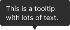
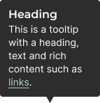
Info: Tooltips that include formatted text, links, or images for more detailed information.
View Code
Bitbucket RepoPositioning
Tooltips can appear above, below, to the left, or to the right of the info icon, depending on the available space and design preferences.
Accessibility
- Attributes: Use aria-describedby to associate the info icon with the tooltip content.
- Keyboard Navigation: Ensure tooltips can be triggered and dismissed using the keyboard.
- Screen Readers: Use appropriate ARIA roles and properties to ensure screen readers can interpret the tooltip content.
- Timing: Ensure tooltips remain visible long enough for users to read the content, but also dismissible when no longer needed.
Crimes

DO
Keep tooltip content concise and relevant to the context.
DO NOT
Avoid using tooltips for critical information that users must see; they should supplement, not replace, essential content.