 Panels
 View in Figma
Overview
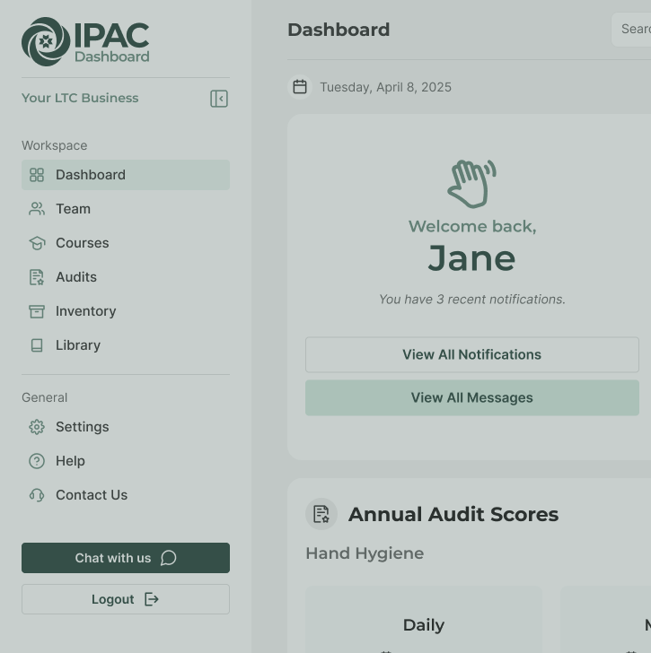
Panels are used to group content within a hidden side panel that becomes visible upon clicking a related button. They are versatile components that can contain forms, lists of messages, notifications, and interactions with employees or our AI assistant, Pathogen Patty.
Anatomy
Here is the anatomy of a standard panel component.
- Heading: The title of the panel, summarizing its content.
- Close Icon: An icon to dismiss or close the panel.
- Content Area: The main area where the panel's content is displayed. The content area can optionally contain forms, messages, notifications and interactions.
- Button Group: May optionally contain buttons to 'Save' the form, 'Add additional forms', or to navigate to a different panel.
Types
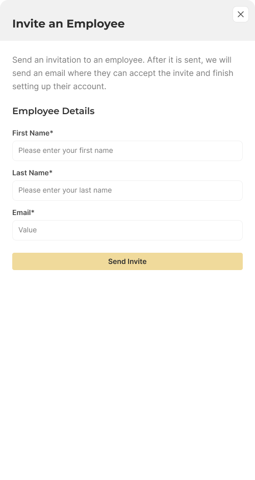
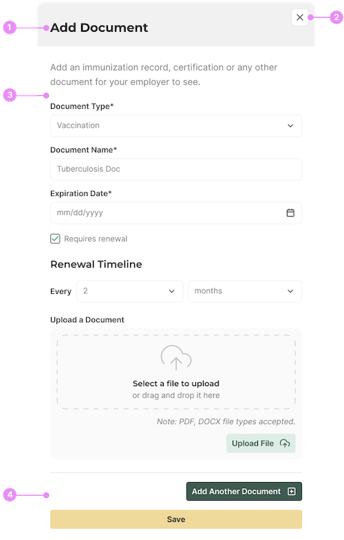
Forms
Info: Panels containing various form elements for user input. Text inputs, checkboxes, radio buttons, file uploads, etc.
View Code
Bitbucket Repo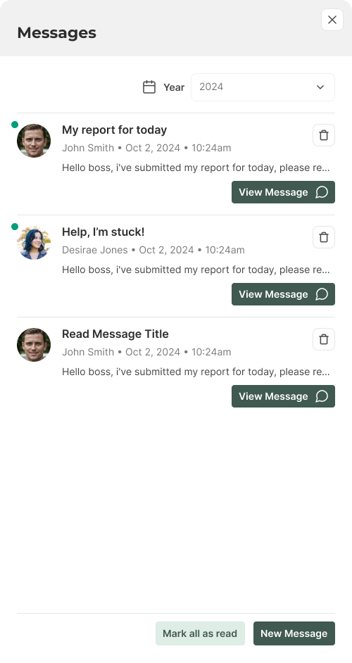
Messages List
Info: Panels displaying a list of messages and providing a messaging interface.
View Code
Bitbucket Repo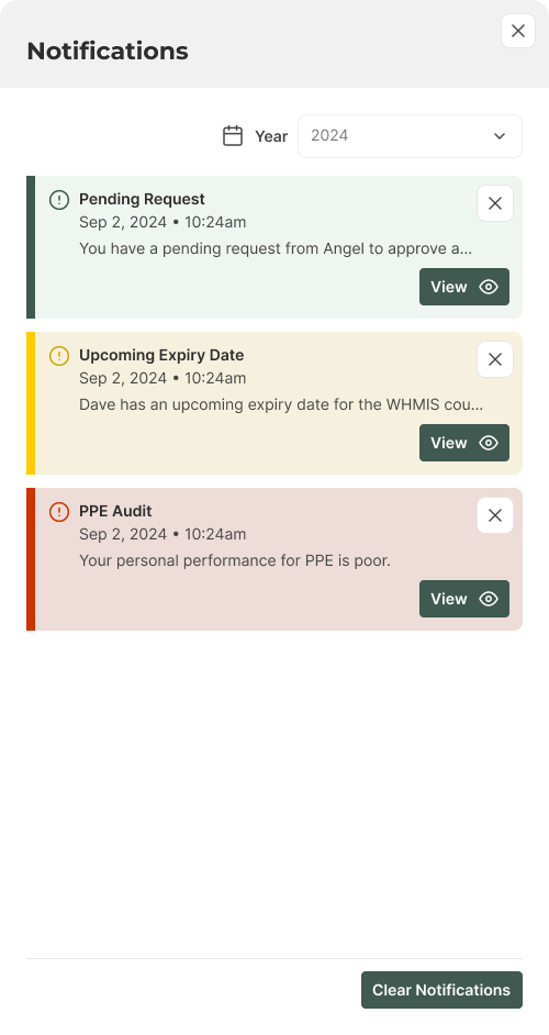
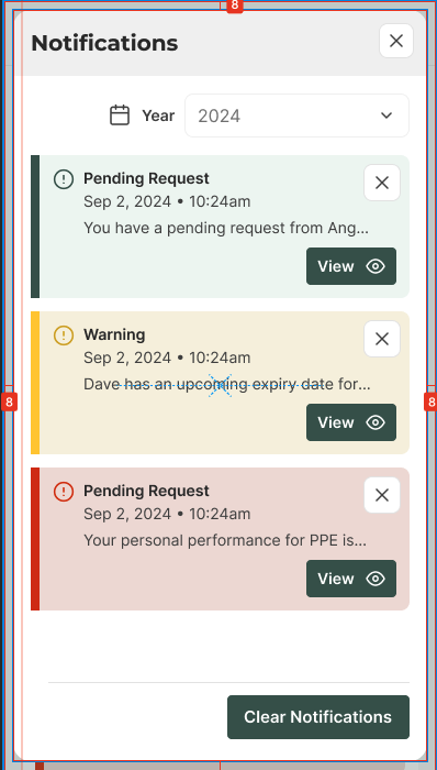
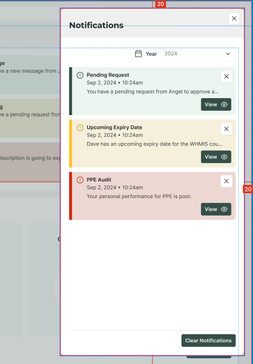
Notifications
Info: Panels showing notifications and alerts. List of notifications, action buttons.
View Code
Bitbucket Repo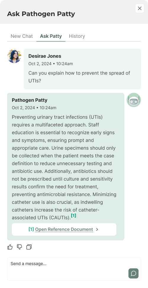
Interaction
Info: Panels for interacting with employees or Pathogen Patty. Chat interface, input field, send button.
View Code
Bitbucket RepoOverlay and Offset
Page Overlay
Info: Panels sit on a page overlay that dims the background
content. Our overlay colour is a 25% opacity of primary-500.
Mobile Offset
Info: Panels are offset space-2 from the edge of
the screen.
Desktop Offset
Info: Panels are offset space-5 from the top right
of the screen.
Accessibility
- Ensure all panel elements are keyboard accessible.
- Provide ARIA roles and properties for panels (e.g., role="dialog").
- Use descriptive labels for buttons and icons.
- Implement screen reader support for panel content.
- Ensure panels are dismissible for users who rely on assistive technologies.