 Pagination
 View in Figma
Overview
The pagination component allows users to navigate through large sets of data by dividing it into pages. It is used in our dashboard application and website to enhance data browsing and improve user experience. Pagination is used in tables, lists, and other data-heavy components to provide a manageable view of data.
Anatomy
The pagination component consists of the following elements:
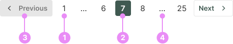
- Page Numbers: Pages which are available to view. These are displayed as transparent buttons.
- Current Page: Displays the current page. These are displayed as primary buttons.
- Previous and Next Buttons: Allows users to navigate to the previous or next set of pages.
- Ellipses (...): Indicates that there are additional pages not currently displayed.
Types

Desktop
Info: Shows page numbers for the current page, at least one page immediately before and after the current page, and the first and last pages.
View Code
Bitbucket Repo
Mobile
Info: Shows page numbers for the current page, previous and next pages, and the first and last pages. Previous and next text is screen reader only for accessibility.
View Code
Bitbucket RepoAccessibility
- Keyboard Navigation: Users can navigate through the pagination using keyboard arrows and interact with buttons using the Enter key.
- Screen Reader Support: Pagination elements are labeled with appropriate ARIA roles and attributes to ensure compatibility with screen readers.
- Touch Targets: Buttons are designed to be easily tappable on touch devices.
Crimes
DO NOT
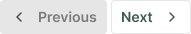
Don't hide essential navigation buttons, such as 'previous' and 'next'.