 Navigation
 View in Figma
Overview
The Navigation or header is a critical component for guiding users through our website and dashboard products. It ensures users can easily find and access different sections and features. This documentation covers the anatomy, variations, and accessibility considerations for both mobile and desktop navigation designs.
Dashboard
Anatomy
Dashboard Header

- Page Title: Displays the current page you are on.
- Search: Enables you to search the entire dashboard.
- Alert and Notification Buttons: A red dot appears over these buttons when you have an alert or notification. Clicking on these will bring up the respective panels for each.
- User Info: Displays the users profile picture as well as their name.
Dashboard Navigation
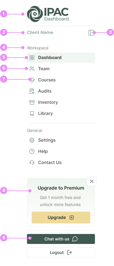
- Logo: The IPAC Dashboard Logo.
- Client name: Once a client is logged in, their business name will show here.
- Collapse Button: Collapses the desktop navigation into a more compact form.
- Heading: A heading to categorize the links below it.
- Active Link: Highlights the current page you are on.
- Link: A navigation link.
- Icon: An icon that is paired with the navigation link text.
- Upgrade Callout: A callout to prompt users to upgrade their plan.
- Buttons: Chat and Logout buttons.
Website
Anatomy
Website Header

- Logo: The IPAC Consulting logo.
- Top Navigation: A smaller navigation highlighting our phone number, email and account info.
- Account info: The logged in users name, along with how many items are in their bag.
- Navigation Links: Links to our websites pages.
- Navigation Buttons: Buttons to highlight the more important pages of our website.
- Search Button: Clicking this will bring up a site search.
Dashboard
Variations

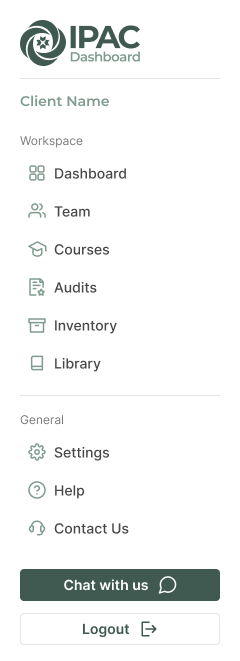
DashboardCompact Navigation
Usage: After clicking the collapse button, this more compact state will show.
View Code
Bitbucket Repo
Dashboard Mobile Navigation
Usage: The mobile version of the dashboard navigation.
View Code
Bitbucket RepoWebsite
Variations

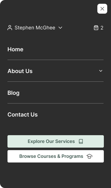
Website Mobile Navigation
Info: On the mobile header, clicking the hamburger button will toggle this navigation.
View Code
Bitbucket RepoAccessibility
- Ensure all navigation elements are keyboard accessible.
- Provide ARIA roles and properties for navigation landmarks.
- Ensure sufficient color contrast for text and icons.
- Use descriptive labels for icons and buttons.
- Implement skip navigation links for screen readers.
- Ensure responsive design for seamless navigation on different devices.