 Lists
Lists View in Figma
Overview
Lists are essential components for organizing and displaying information in a clear and structured manner. They can be used in various contexts, such as detailing information, presenting steps, or highlighting features. Our list components are designed to be versatile and accessible, ensuring a consistent user experience across different platforms.
Anatomy (Details List)
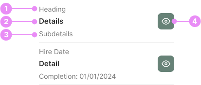
- Heading: The main title that summarizes the content of the list.
- Details: The primary information or description related to the heading.
- Subdetails (optional): Additional, more specific information that complements the details.
- View Button (optional): An interactive element that allows users to access more in-depth information or perform an action.
Types
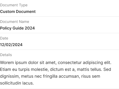
Details List
Info: A structured list that includes headings, details, subdetails, and interactive elements like view buttons, designed to provide comprehensive information about each item.
View Code
Bitbucket Repo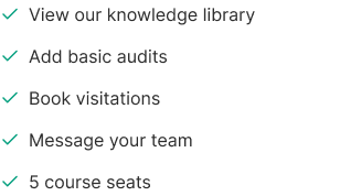

Feature Check List
Info: A specialized list that displays a more prominent checkmark icon.
View Code
Bitbucket Repo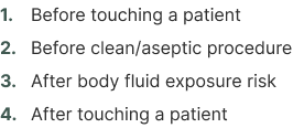
Ordered List
Info: A list where items are arranged in a specific sequence, typically numbered, to indicate a particular order or priority.
View Code
Bitbucket Repo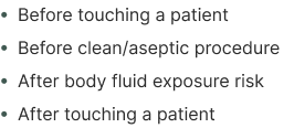
Unordered List
Info: A list where items are presented without any specific order, usually marked with bullet points.
View Code
Bitbucket RepoAccessibility
- Ensure all list items are readable and have sufficient contrast with the background.
- Use semantic HTML elements (<ul>, <ol>, <li>) to ensure proper structure and screen reader compatibility.
- Provide clear focus states for interactive elements like buttons and checkboxes.
- Ensure that all interactive elements are keyboard navigable.