 Cards
Cards View in Figma
Overview
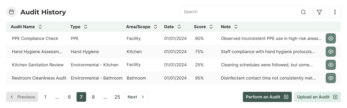
In our Dashboard product, all content is typically placed inside a card. Cards are versatile and can contain
various elements such as headings, icons, text, tables, charts, and buttons. They can also include optional
components like search, filter, kebab menus, and pagination, depending on the context. Cards are always white
(surface-base in light theme) and can have a light gray border or shadow for depth.
On our website, cards are used to display information about our products and services. They typically contain a
thumbnail, heading, price, and button. Cards are always white (surface-base in light theme) and can
have a light gray border or shadow for depth.
Card Anatomy
A card in our dashboard typically includes:
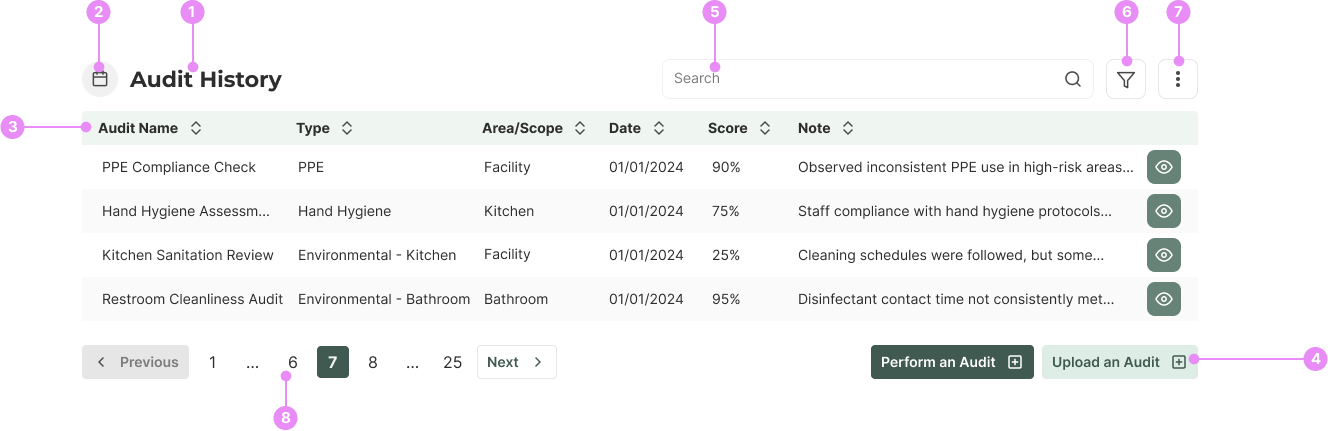
- Heading: Uses the <h2> element for hierarchy.
- Icon: Can be placed beside the heading, pulled from our icon library.
- Inner Content: This can be text, tables, charts, etc.
- Button Group: For actions related to the card's content.
- Search component: (visible on desktop, hidden in filter menu on mobile).
- Filter Menu (optional).
- Kebab Menu (optional).
- Pagination (optional).
Card Anatomy
Horizontal Service Card
- Heading: Uses the <h3> element for hierarchy.
- Thumbnail: An image representing the product or service.
- Description: Service description.
- Button Group: For actions related to the card's content.
Product/Course Card Anatomy (Website)

- Card Heading: Uses the <h3> element for hierarchy.
- Thumbnail: An image representing the product or service.
- Price: The cost of the product or service. If there is no price, it will be substituted with 'Contact Us'.
- Button: For actions related to the card's content.
Variations
Desktop
Info: A card with a heading, icon, text content, and a button. Used for displaying various content types with 20px (space-5) padding on desktop.
View Code
Bitbucket Repo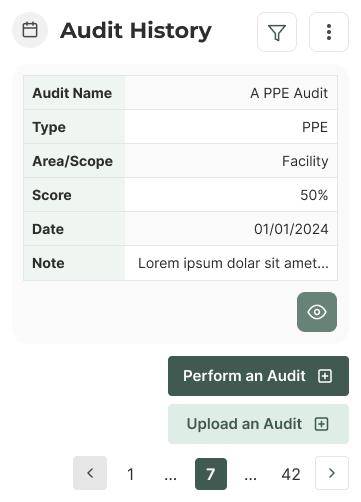
Mobile
Info: A mobile card with a heading, icon, filter and kebab menu, table, pagination and a button group. Used for displaying various content types with 12px (space-3) on mobile.
View Code
Bitbucket Repo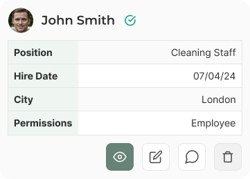
Employee Card - Mobile
Info: A card with a heading, icon, table, and a button. Used for displaying various content types with 12px (space-3) on mobile.
View Code
Bitbucket Repo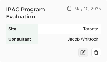
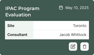
Visits Card
Info: A visits card, which contains a heading, date, table, and action buttons.
View Code
Bitbucket RepoVariations

Product/Course Card
Info: A card with a thumbnail, heading, price (replaced with 'Contact Us'), and button. Used for product and service information. This card has 16px (space-4) padding on desktop, and 8px (space-2) on mobile.
View Code
Bitbucket Repo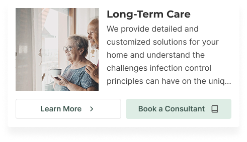
Horizontal Service Card
Info: A card with a thumbnail, heading, description, and button group. Currently, this is only being used on the 'book a consultant' page. This card has 16px (space-4) padding on desktop, and 8px (space-2) on mobile.
View Code
Bitbucket RepoAccessibility
- Ensure all text within cards is readable and contrasts well with the background.
- Icons should have appropriate alt text for screen readers.
- Interactive elements like buttons should be easily navigable via keyboard and have clear focus states.
Crimes
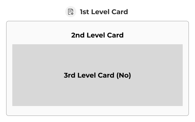
DO NOT
Nest cards more than one level deep.
DO NOT
Use background colors other than surface-base or surface-raised.