 Buttons
 View in Figma
Overview
Buttons are essential interactive elements in any user interface. They enable users to perform actions and make choices with a single click or tap. This section outlines the guidelines for designing and using buttons in our system.
Anatomy
Buttons typically have a label and can include an icon before or after the label.
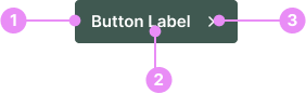
- Button: The selectable area of the button.
- Label: Text describing the button action. Use action verbs or phrases to tell the user what will happen next, and follow the button label content guidelines.
- Icon (optional): Most buttons don't need an icon. Use an icon to add additional affordance where the icon has a clear and well-established meaning.
Types
Default - Primary
Info: The main action button, usually highlighted with the primary color to draw attention.
View Code
Bitbucket RepoSecondary
Info: A highly noticeable button used to draw significant attention, standing out even more than the primary button.
View Code
Bitbucket RepoLight (Primary-50)
Info: A lighter version of the primary button, using a softer shade of the primary color for less emphasis.
View Code
Bitbucket RepoWhite
Info: A button with a white background and gray stroke. This button works well on light or dark backgrounds.
View Code
Bitbucket RepoStates
Hover
Info: Changes appearance when the cursor is over it. The hover
color is always black.
View Code
Bitbucket RepoButton with Icon
Icon Before
Info: Icons can be placed before a label. Swap the icon depending on the context of the button.
View Code
Bitbucket RepoIcon After
Info: Icons can be placed after a label. Swap the icon depending on the context of the button.
View Code
Bitbucket Repo
Icon Button
Info: Icon buttons contain only icons and no text, used when the icon alone conveys the function. They are frequently utilized in our dashboard product and website header.
These buttons may be colored as Primary, White, or Gray. Their heights should match normal buttons when placed beside them. In tables, they are called Action Buttons.
View Code
Bitbucket RepoButton Sizes
Small
Info: 34px height. Used commonly throughout the dashboard to save space.
View Code
Bitbucket RepoDefault
Info: This is the default button size, and should be used for most cases. 40px height.
View Code
Bitbucket RepoButton Groups
Info: Use a button group when you want to display more than 1 button side by side. Ensure there is a gap of at least 8px between buttons.
Full Width
Info: Buttons can expand to full width to fill the parent container. This can be useful for panels and forms.
Accessibility
- Contrast: Ensure sufficient contrast between the button text and background.
- Size: Buttons should be large enough to be easily tapped or clicked.
- Labels: Use clear and concise labels that describe the action.
Crimes
DO NOT
Include more than one primary or secondary button in a button group.