 Alerts
 View in Figma
Overview
Alerts are used to inform users about important information, warnings, or errors. They are designed to capture the user's attention and provide actionable feedback. This documentation covers the anatomy, variations, and accessibility considerations for the alerts component.
Anatomy

- Warning Icon: An icon indicating the type of alert (default, warning, danger).
- Heading: A brief title summarizing the alert.
- Description: Detailed information about the alert.
- Button Group: A set of buttons for user actions related to the alert.
- Close Icon: An icon to dismiss the alert.
Variations
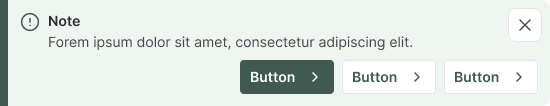
Default Alert
Info: Shows general information or notifications. Neutral color scheme (primary) with a standard warning icon.
View Code
Bitbucket Repo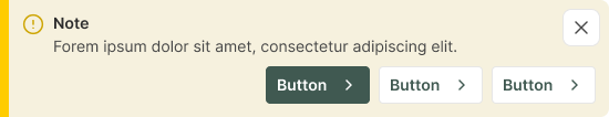
Warning Alert
Info: Alerts that require user attention but are not critical. Yellow color scheme with a warning icon.
View Code
Bitbucket Repo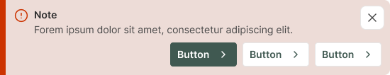
Danger Alert
Info: Critical alerts that require immediate user action. Red color scheme with a danger icon.
View Code
Bitbucket Repo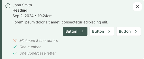
Optional Elements
Info: An alert may contain a user's name, date and time and checklist.
View Code
Bitbucket RepoAccessibility
- Ensure all alert elements are keyboard accessible.
- Provide ARIA roles and properties for alerts
(e.g., role="alert"). - Ensure sufficient color contrast for text and icons.
- Use descriptive labels for icons and buttons.
- Implement screen reader support for alert content.
- Ensure alerts are dismissible for users who rely on assistive technologies.